Making Data Visualizations Personal05/08/2019
At Prominence, we use data in innovative ways that bring value to healthcare organizations and the patients they serve, value like improving clinic operations, increasing quality of care, decreasing AR, and more. But this blog post isn’t about those large-scale types of ROI.
In today’s blog post, we are taking a look at what it means to get personal with data. Through analyzing data from personal, non-traditional data sources, you can enrich your understanding of what it means to get value from data that you may be overlooking every day. When you take this approach and bring data to a more personal level, you can tell new and meaningful stories with your data.
At the 2018 Tableau Conference, Giorgia Lupi gave an inspiring presentation on her data visualization philosophies, including her thought-provoking perspective on Data Humanism and her seemingly eccentric, year-long project with Stefanie Posavec called Dear Data. I was drawn to Giorgia’s ideas on bringing data to a personal level using a more human (read: imperfect) approach to allow data consumers to have a more intimate experience with data visualizations. Through the year-long Dear Data project, Giorgia and Stefanie captured personal data about their lives, one topic per week at a time, and then hand drew that data on post cards to mail to each other. It was a very intricate project that opened up a whole new realm of learning about each other. Through using hand drawn data visualizations, they became closer to their data in a way that meant each pen stroke was very intentional and meaningful to the message they wanted to convey.
For me, after 10 years working in the Healthcare IT industry, the idea of abandoning software like Epic, Tableau, QlikView, or Qlik Sense to create manual data visualizations seemed ridiculous. These software tools allowed fast, almost seamless creation of data visualizations that provide value every day. However, I wanted to give Giorgia and Stefanie’s Dear Data project a try and explore the realm of hand drawn data visualizations!
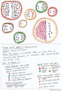
I found a fellow data nerd (my college bff who now lives across the country from me) to embark on our own Dear Data project. For example, in March, we spent a week tracking the compliments we gave and received in our day-to-day lives. My resulting data visualization turned into a food-based drawing that I felt illustrated how compliments are nourishment in my life.
If you can look past my average drawing skills, you discover a multi-layered data visualization that invites you to spend time with this new pizza-based data visualization type I invented. Giorgia posits that these more intricate data visualizations are valuable when used wisely, because they require you to really think while reviewing and exploring your data. In using non-traditional data visualization styles, you invite users to spend time with their data and to give the data more attention than just a cursory glance you’d give to a sorted bar chart.
Data Visualization Encoded into Pizza
Software-based data visualization tools are all amazingly powerful in terms of bringing some of our most complex healthcare data to life, but it can be invigorating to take a step back and really evaluate the best way to paint the data story you hope to convey. Through hand drawing a data visualization, I felt closer to the points I was trying to make. This very manual method ensured every stroke of my pen was purposeful and not wasting any space with trivial elements, which can become a pitfall when using speedy software tools that make prolific data visualization creation a snap.
Have you considered enriching existing initiatives around things like patient engagement with opportunities like “Dear Data” which would allow patients to have fun with their own data and make them more informed, data literate allies in their own care? Tell us about it; we’d love to collaborate with you as you consider using personalized data at your own organization!